dawg pound
The Cleveland Browns Are Holding A Contest To Decide Their New Logo — So I Drew One

The Cleveland Browns have been the NFL's laughing stock for decades. They've accomplished nothing, seen their city get passed by in the 21st century and are such total jokes. The only reason we would ever talk about them is because they screw up in the draft or signed a quarterback who violated the league's personal conduct policy.
The Cleveland Browns have one main identity besides losing: the color brown. Well, also orange, but that's besides the point. The team is named after their founder, but their logo for a while has just been a helmet. It's a helmet, it's a clear lack of a logo. It's embarrassing, almost as much as not having a team name. Beyond stupid, IMHO.
So, inspired by their fans the Dawg Pound, the Browns are holding a contest to rebrand and get a new logo. How a dog, and not an elf, became their go-to animal is beyond me. You can vote now on your favorite two. Will the team really let the public decide, or will they avoid having to go with the internet's decision? You can never trust the online trolls, or else your boat gets named Boaty McBoatface. But I can design a better logo! Let's look at the nominees, and then the one I came up with.
We're nearing the final stage! Every 30 minutes throughout the morning we'll be revealing our 5️⃣ finalists for the last round of voting to become the official logo of the #DawgPound.
— Cleveland Browns (@Browns) May 8, 2023
First up, you all decided the most popular fan submitted design was Emily Morgan's! 🐾 pic.twitter.com/Uk8KZvGx9b
This isn't the best, nor is it the worst. It's actually the third best of them, it's alright. Hard to draw from memory, maybe a little scary for kids, but it works as a perfectly cromulent logo. It's mid, just fine.
next dog logo option! 🐶 pic.twitter.com/D4fhq7WXcj
— Cleveland Browns (@Browns) May 8, 2023
So the dog has a sort of football helmet in his head(?), which I don't like, but otherwise this is a better logo than the one above. That weird white stripe in his head isn't working.
this one has some grit to it 😤 pic.twitter.com/Wy1BOFRe2t
— Cleveland Browns (@Browns) May 8, 2023
This is the second-best one yet, I really like this dog's design. Simple, clean and intense without it being, like, super scary.
more of a throwback look here pic.twitter.com/76QVMHkuHM
— Cleveland Browns (@Browns) May 8, 2023
It's just an ugly looking cartoon dog, it doesn't inspire anything. It looks like he has a band-aid on his head, and he lacks the grit or toughness of the other entries, and is just a droopy looking dope. Easily the worst entry on the list.
this design is clean 😯 pic.twitter.com/nA9Gwf1Eka
— Cleveland Browns (@Browns) May 8, 2023
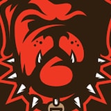
Dignified, clever, visually interesting and something all fans can be proud of; this is the best logo of them all. You could even do something more with his spiked collar, that thing in the middle.
So this is what I drew based off of my memory of their previous logo, which might have not been an official one but the internet remembers, so here is what it looks like in my head:

For reference, this is what I was going for (top-left):
Who will make a Super Bowl first? 🤔 pic.twitter.com/m7z98V0Zic
— PFF (@PFF) May 8, 2023
