


Hello everyone, Jared here. I love basketball, I love the NBA, and I love giving grades to things and being judgmental. But I also do not understand fashion whatsoever, so what better way to combine all of these skills into one comedy column than to rank the best new jerseys coming our way! Get hype for the season starting soon, and get ready to puke when you see some of these on your television.
First, let's go through the saga of the leaks. The following images got spoiled, and the internet has been abuzz about them for well over a year now. Some have been confirmed, some have not, but there's a seemingly neverending supply of new gear to buy each and every season. The NBA loves money, but at least they employ artists to take a stab at redoing things.
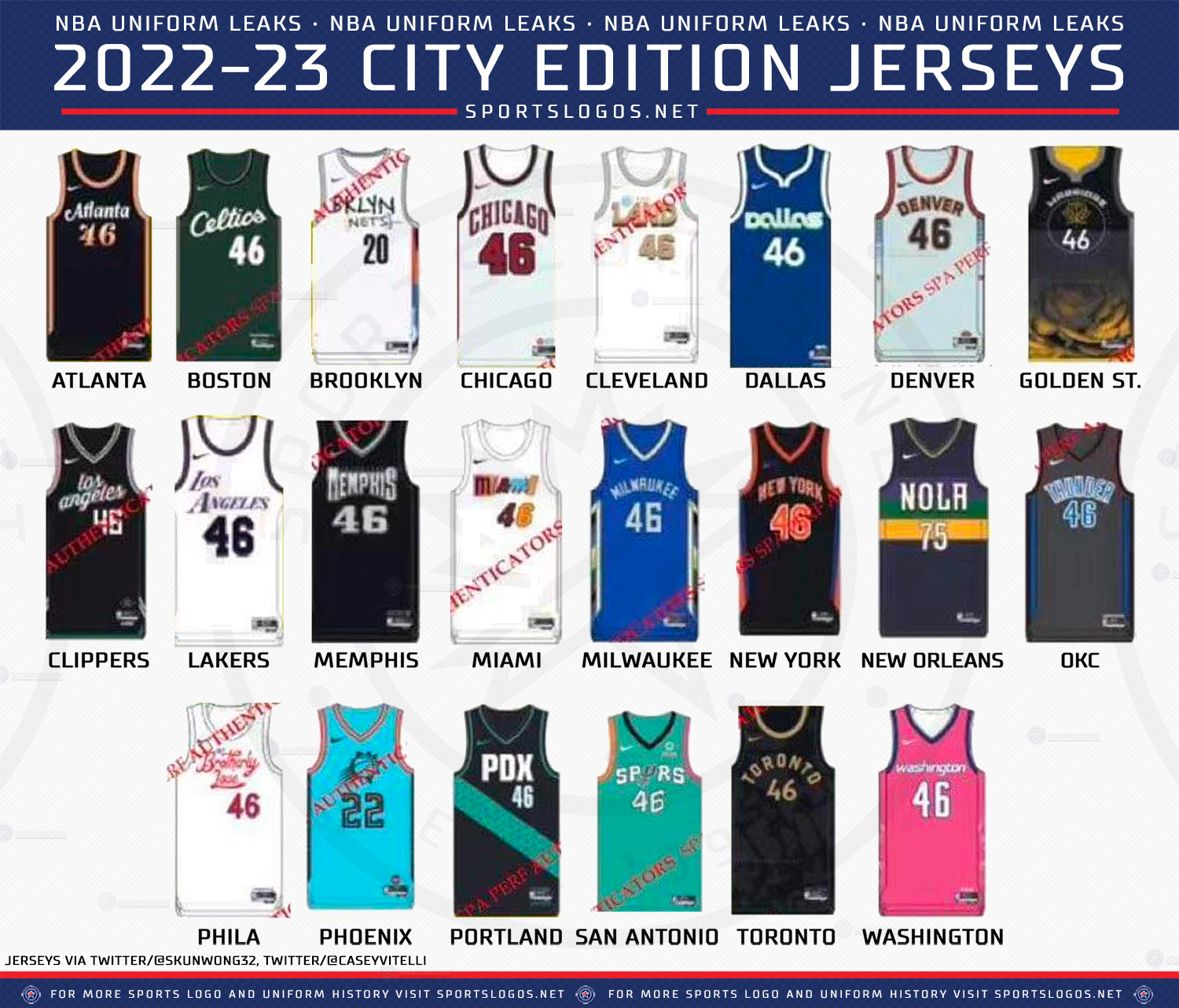
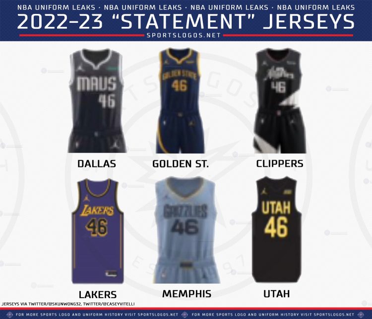
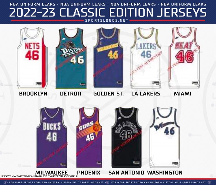
This all includes a mix of alternate jerseys, "City Edition" jerseys, throwback jerseys, and "Statement" jerseys. Keep that in mind.
Some of those are old, too, so it's a weird collection of leaks.
The new yellow neon Utah Jazz color scheme might be the worst thing any team has produced ever, that needs to GO.
Love a good throwback jersey, I respect the history.
Now that you have that context of us seeing those for months on end, let's look at the individual teams and give them a letter grade. These are in alphabetical particular order, and you should not take this seriously. Mostly because I would be very critical of any Knicks jersey, as a hardcore fan. But a handful of teams are not on this list: New York Knicks, Toronto Raptors, Chicago Bulls, Indiana Pacers, Memphis Grizzlies, Sacramento Kings, and New Orleans Pelicans.
Atlanta Hawks: A-
I'm a fan of the font, the subtle peach colors on the sides, this is a great jersey IMHO.
Boston Celtics: C-
First Look at Boston Celtics 2022-23 “City Edition” jersey.
— GreenRunsDeep (@CelticsGRD) October 14, 2022
Boston will wear this jersey Opening Night Tuesday, then these 10 other games…
11/23
12/13
12/25
1/24
1/28
2/12
2/25
3/5
3/11
3/28 pic.twitter.com/EaqMApZIxO
I get what they're going for here, but it's a hat on a hat. Either pick the green and yellow or stick to the black and green. The font on the front should match the one on the back. This was a risky choice, and it all didn't quite pay off. The cursive font though is cool and classy, but no one should be messing with the Boston jerseys, honestly.
Brooklyn Nets: C+
2022-23 Statement Edition. Coming this fall. pic.twitter.com/QyvjmyBaPp
— Brooklyn Nets (@BrooklynNets) September 13, 2022
These are boring and fine. Just like the team. Very whatever. They do not make a statement, like the name implies though.
Charlotte Hornets: A-
It starts with a love of the game & a desire to be great. The journey starts with YOU.
— Charlotte Hornets (@hornets) September 16, 2022
Presented by @LendingTree pic.twitter.com/EmiXMqXdGi
There's a lot going on, with the font and colors and the sides, but I really love the futuristic take on these. The little hexagons are a nice touch, I'm a fan of the whole vibe.
Cleveland Cavaliers: B-
Cleveland Cavaliers unveil three new uni designs for 2022-23 season. pic.twitter.com/XYGGGHCiKb
— Maury Brown (@BizballMaury) July 18, 2022
None of those are offensively bad, and not quite blah, but they're decent. Acceptable and respectable, much like the team itself.
Dallas Mavericks: A+
A new Mavericks jersey has recently surfaced.
— Legion Hoops (@LegionHoops) October 12, 2022
Thoughts? 👀 pic.twitter.com/zm3myRLssX
This is going to be controversial, but I loved the Nash era Dallas stuff. The green, the '70s font, I'm a gigantic fan of this. These should be the permanent jerseys, get rid of the boring blue/white horse logo nonsense.
Denver Nuggets: C
The Mile High woven into every detail 🧵🏔 pic.twitter.com/MmFHFjFeHA
— Denver Nuggets (@nuggets) September 22, 2022
Bleh. Don't mix red and blue with yellow, it stings my eye. You're not Superman. And give us back those rainbow uniforms, those are the best.
Detroit Pistons: B-
Pistons’ jersey rotation this year 😮💨😮💨 pic.twitter.com/Z8rZPdOBMG
— BULLYBALL (@RealBullyBall) October 12, 2022
Okay, this is a lot to take in. The classic ones are good. The throwbacks are great, love the teal. The green ones are questionable but not the worst thing in the world. The DET stripe ones? Bring the entire lot down a full letter grade, awful.
Golden State Warriors: B
30 approved ✔️@Rakuten || Classic Edition pic.twitter.com/vZdVaX0FEU
— Golden State Warriors (@warriors) August 8, 2022
Not half bad, Golden State. Not bad at all. Minimalistic and classy. Good job.
Houston Rockets: F
Greatness in every thread. pic.twitter.com/H9tpzrqwgP
— Houston Rockets (@HoustonRockets) August 31, 2022
These are supposed to honor the San Diego Rockets. They don't. The stripe is bad, the colors are bad, the shiny nature to it all, bad. Just bad. Stick to red and don't ever do this again.
LA Clippers: B
A closer look at the 2022/23 𝕷𝖔𝖘 𝕬𝖓𝖌𝖊𝖑𝖊𝖘 Statement Edition.
— LA Clippers (@LAClippers) September 29, 2022
This uniform symbolizes the team's driven mindset, relentless style of basketball and the commitment to the city of 𝕷𝖔𝖘 𝕬𝖓𝖌𝖊𝖑𝖊𝖘.
Am I the only one in the internet who likes these? The font, the red and blue on different shoulders, I think these are hot. The pants, maybe less so, but the rest I dig. Having four colors on a uniform is hard to pull off.
LA Lakers: B-
Purple base & Gold details
— Los Angeles Lakers (@Lakers) September 15, 2022
Introducing the 2022-23 Statement Edition@bibigoUSA x #LakeShow pic.twitter.com/8uitexSjqX
The sides make me not like these as much. Again, the Celtics and Lakers should not be doing these experiments, just stick to what works. Don't try and improve perfection.
Miami Heat: A
Debuted in 1988. Returning in 2023.
— Miami HEAT (@MiamiHEAT) August 31, 2022
Our Classic jersey is back for the 35th season of HEAT Basketball. pic.twitter.com/BOXAOGOfR1
The best team at doing any uniforms is the Miami Heat. They already had those Miami Vice ones, which are beyond fabulous, and these are the throwbacks. Just (chef's kiss) perfection.
Milwaukee Bucks: B-
From the woods to the hardwood. pic.twitter.com/X3GHKN0ysh
— Milwaukee Bucks (@Bucks) July 27, 2022
I get the antlers thing, and I like the subtle use of blue. It's alright. I'm not sure a classic, vintage franchise should have modern blocky lettering and the Motorola logo slapped on there, but who am I to judge someone profiting off of capitalism.
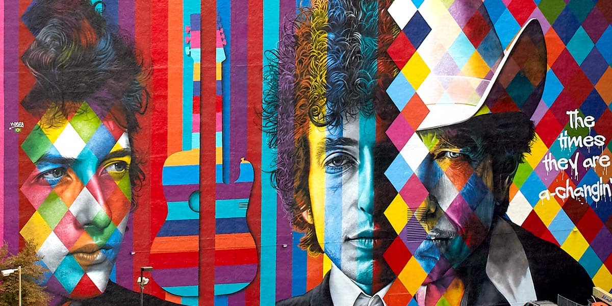
Minnesota Timberwolves: D+ For The Black and Neon Green, A For The Bob Dylan Tribute
Statement Made. ❇️ pic.twitter.com/aVNfsKWJgX
— Minnesota Timberwolves (@Timberwolves) September 15, 2022
Okay I had to split these. The ones above are close to being okay, but the stripe at the top and bottom is weird and there's no blue. Black and neon green are not the team's colors, it's just bizarre.
Really??? pic.twitter.com/rkMrHaud7A
— Michelle Sichak 🇺🇦 (@MichelleSichak) October 11, 2022
As a fan of Robert Zimmerman himself, and this mural, I totally get this. Not a lot of people will like it, but I do. The Prince jerseys the Wolves did are the gold standard, but these are also quite fetching and lovely, I like the white and rainbow, it clashes well.
OKC Thunder: A-
City Edition | Oklahoma City Thunder
— Casey Vitelli (@caseyvitelli) June 10, 2022
Here is a HQ version of the Thunder's new "City Edition" to be worn next season.
*NOTE*
Design might not be 100% accurate pic.twitter.com/SU5Gg1h1lN
Not a lot of history to back the Thunder doing throwbacks, and it would be an insult to do Supersonics ones. So I quite like this simpler design. No logo, no yellow or orange, just a cool electric blue and black. Very crisp stuff, I'd buy one if I was a fan.
Orlando Magic: B+

Love the stripes, the solid colors, the logo on the belt and the Disney sponsor. Very classy, and I dig them.
Philadelphia 76ers: B-
Sixers City Edition Jersey’s. pic.twitter.com/TJ63ISUH6H
— The Phifth Quarter (@The_PhifthQ) October 8, 2022
I get what they're going for, and I respect it. The empty space, the vertical stripe, the font, the name, but it just doesn't come together like it should. Some people already hate this, but I don't hate it, simply because I've seen worse. Much worse. Speaking of...
Phoenix Suns: F- and then an A+
A new Suns jersey has been recently leaked. 😳
— Legion Hoops (@LegionHoops) October 13, 2022
(via @NoahSuns) pic.twitter.com/EqOH9ONCIt
What in the hell is this shit? Is this a joke? Are you kidding me? What elementary school student in Flagstaff with a box of crayons designed this nonsense?
𝐓𝐇𝐄𝐘'𝐑𝐄 𝐁𝐀𝐂𝐊.@PayPal | https://t.co/mOggQGcSQa pic.twitter.com/9KNoCCZapO
— Phoenix Suns (@Suns) August 23, 2022
These are the best throwback uniforms in the league. Just stick to these, Suns, please. I know you're selling the team because your owner was human garbage but someone has to step in here.
Portland Trailblazers: A-
Designed by Dame ⌚️
— Portland Trail Blazers (@trailblazers) October 1, 2022
Learn More: https://t.co/eMq81ARIzn pic.twitter.com/CJteLsgz3d
Art director Dame did a good job, love the spiral logo and the horizontal stripes. I very much enjoy what Portland does with their history and colors, and this doesn't stray at all from the norm, unlike those god awful blue Suns ones.
San Antonio Spurs: D-
Culture isn’t just where we’re from. It’s where we’re going. Introducing our 2022-23 Statement Edition uniform!@SelfCreditApp | #PorVida pic.twitter.com/a2JrGGHLDl
— San Antonio Spurs (@spurs) July 25, 2022
Army camo? SATX? No, sorry, you were so close to getting this right, but these are not it. No one is going to say it like you want to, the SA, TX just comes off as one word: satix. Bad.
Utah Jazz: A+ and then an F-
🖤☯️ The 𝙍𝙀𝙏𝙐𝙍𝙉 & the 𝚁𝙴𝙼𝙸𝚇 ☯️🖤
— Utah Jazz (@utahjazz) June 17, 2022
Purple is back and here to stay.#TakeNote pic.twitter.com/hwCtmSXDiA
What a throwback, among the very best designs in NBA history. While the name Jazz makes zero sense for Utah, the mountains make up for it.
📢 Breaking: The 2022-23 @utahjazz uniform schedule has been released:
— Jazz Uniform Tracker (@JazzUniTracker) October 12, 2022
Check it out ⤵️
(schedule subject to change throughout the season) pic.twitter.com/RMgUR93vWt
Yellow? Bright neon yellow? With nothing else? The worst redesign I have ever seen, the worst in the league by far.
Washington Wizards: A+
Us @Nationals
— Washington Wizards (@WashWizards) March 29, 2022
🤝
🌸🌸🌸🌸 pic.twitter.com/AgiNvGWEmE
The only team brave enough to wear pink is also the one that honors its city the best in these "City Edition" jerseys. They showed this at the start of the year, and haven't been topped yet. The best came last, good job Washington, your team is still a dumpster fire though.

