DRIVE RESPONSIBLY

American States With The Worst Drivers In 2022, Visualized

American States With The Worst Drivers In 2022, Visualized
Traffic deaths increased between 2020 and 2021. Here's what this year's numbers show so far.
· 13.7k reads ·
· ·

Patrick Villanova, SmartAsset's personal finance expert, looked at America's most reckless drivers in each state.

National Highway Traffic Safety data shows that traffic deaths went up in 2021.

The SmartAsset team looked at four key points โ€” DUI arrests/1000 drivers, number of fatalities per 100M vehicles miles driven, searches for "traffic" and "speeding" ticket โ€” to determine which state had the worst drivers.

Here's what they found.


Key Takeaways:

  • Drivers in Mississippi continue to be the worst in America. Nearly one out of every third person behind the wheel in the Magnolia state is not insured and they have the second most (1.9) fatalities per 100M vehicles miles driven.

  • Massachusetts has some of the most responsible drivers. The state's fatalities (0.63) per 100M vehicles miles driven is the lowest in America.

  • DUI incidents were highest in South Dakota (9.21 per 1,000 drivers) and lowest in Pennsylvania (0.02 per 1,000 drivers).

  • Only 3.1 percent of New Jersey's drivers were not insured, making it the most insured state for drivers in the country.


Via SmartAsset.

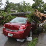
[Photo by Mick Haupt on Unsplash]

[Photo by Mateusz Klein on Unsplash]

Comments

  1. kinsley 1 year ago

    I think this is an oversimplification of the data. There are many other factors such as public transit usage, road design, miles driven, size of vehicles, etc. This really assumes all road fatalities are completely the fault of the driver rather than a systemic problem.

    1. Adwait 1 year ago

      It definitely cuts corners but I feel like it paints a somewhat accurate picture overall.

  2. Robert Davenport 1 year ago

    The map shows California as third worst while the scatter plot shows it squarely center of mass (average). What gives? Is this some sort of weird anti-California bias?

    1. Eric Hines 1 year ago

      The map uses 4 data points, instead of two.

    2. Uday Patel 1 year ago

      Also, all of their metrics except number of fatalities per 100M vehicles miles driven are confounded by differential enforcement in different states. It just makes this meaningless clickbait.

      1. Adwait 1 year ago

        Wouldn't say meaningless, but you're kind of right.

    3. Adwait 1 year ago

      Think the map gives more weight to uninsured drivers, whereas the scatter plot is more binary.


Cut Through The Chaos With Digg Edition

Sign up for Digg's daily morning newsletter to get the most interesting stories. Sent every morning.