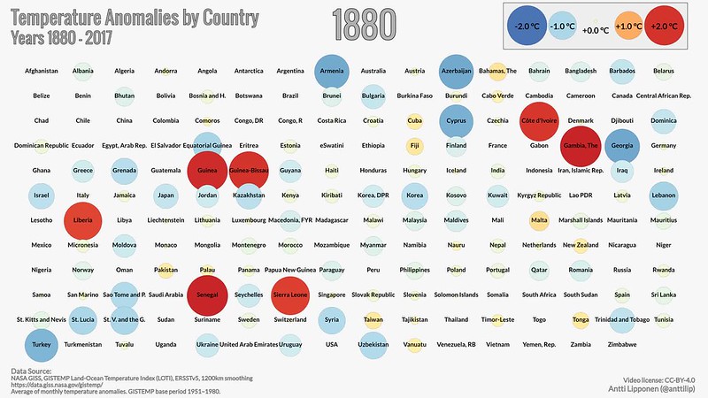
Temperature Anomalies In Each Country Over Time, Visualized
We all know climate change is bad. But there's nothing like a well-crafted data visualization to make you cower in fear about just how bad it is. Antti Lipponen, a research scientist at the Finnish Meteorological Institute who specializes in this kind of thing, put together an incredibly powerful new data visualization showing how climate change has played out in each country over time starting in 1880, using surface temperature analysis from NASA. As you can see, temperature anomalies — deviations from the mean temperature in a given place — have gotten undeniably more common, more extreme and more likely to be hot over time.
We can't wait to see this data visualization updated in the future, when it will presumably just turn into a giant blob of indistinguishable red circles as our planet becomes increasingly uninhabitable.
[Via Twitter]

