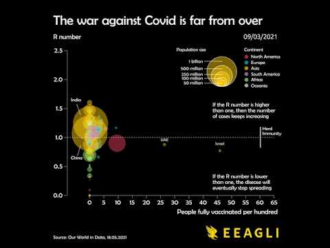
This Data Visualization Demonstrates Why The Fight Against COVID-19 Is Far From Over
James Eagle crunched the data and produced an animated chart showing which countries were leading the way in the fight against COVID-19. It wasn't pretty.
Sign up for our afternoon round-up to get the best videos of the day delivered.
SubscribeSign in to your Digg account.
By signing up, I agree to Digg's Terms of Use and Privacy policy and consent to processing my personal information and receiving marketing emails.
Not a member yet? Sign up
Thanks for creating an account! Your accounts lets you Digg (upvote) stories, save stories to revisit later, and more.
Enjoy your new account! As a reminder, you can change your profile and email settings in your profile.
Get started by creating an account.
By signing up, I agree to Digg's Terms of Use and Privacy policy and consent to processing my personal information and receiving marketing emails.
Already have an account? Sign in
Thanks for creating an account! Your accounts lets you Digg (upvote) stories, save stories to revisit later, and more.
Enjoy your new account! As a reminder, you can change your profile and email settings in your profile.