YIKES
The New York Times Demonstrates The Magnitude Of Unemployment In The United States With An Off-The-Charts Graphic On Front Page
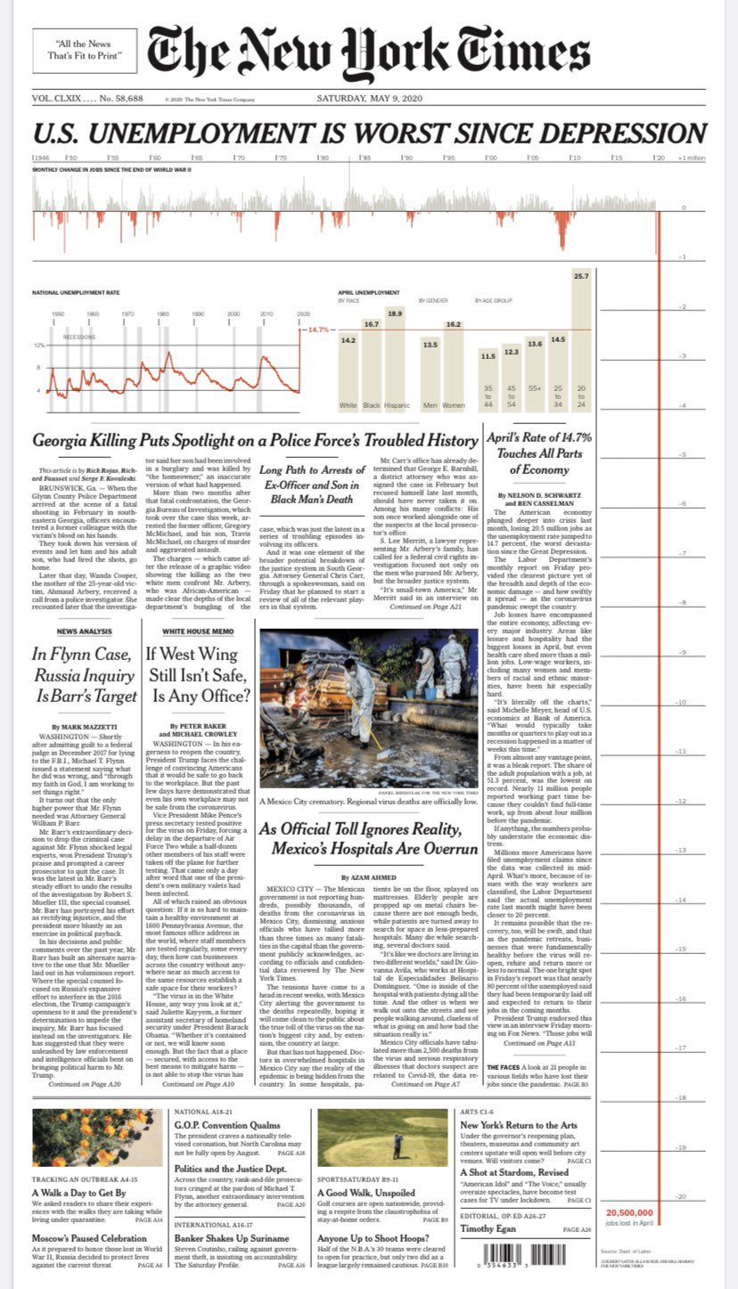
The New York Times dramatically illustrated the enormity of the economic downturn on their front page Saturday, showing how job losses in the United States from April were the worst since The Great Depression with this stunning infographic. Using stats from the Department of Labor, the NYT graphics team used the entire length of the newspaper to convey the gravity of the situation.
The striking visual took a little bit of preparation. Josh Crutchmer, the newspaper's Print Planning Editor, demonstrated how the paper plotted out the graphic.