Slack Announced Its New Logo, And Folks, It's Bad
Do you use Slack at work? There's a solid chance you do, if you're a Digg user, but even if not, you're likely familiar with the logo: a hashtag with overlapping colors:


It was clean, it was colorful, it made sense (you use hashtags in Slack!). It wasn't skeuomorphic but it also hadn't fully embraced the completely flat aesthetic used by every tech company.
But Slack apparently wasn't satisfied. Whether because — as they argue in their rebranding blog post — they wanted simpler colors and more brand cohesion, or because big tech companies constantly feel the need to refresh their brand, the service announced today that they have a new logo:
It's… well, it's not great! The jaunty angle is gone. The colors are still there, but suddenly it would be hard to pick out Slack in a sea of same-y startup logos:
Pentagram Design, the firm behind the new logo, has this to say:
After exploring a wide range of possibilities, the designers decided to retain the equity of the hashtag, or octothorpe, rebuilding it with two basic geometric shapes, a speech bubble and lozenge, that can be extracted and used as graphic elements.
Just because you say "octothorpe" doesn't make it right. And while we can kinda see the logic of working the speech bubble in there, the new logo has some weird visual resonances!
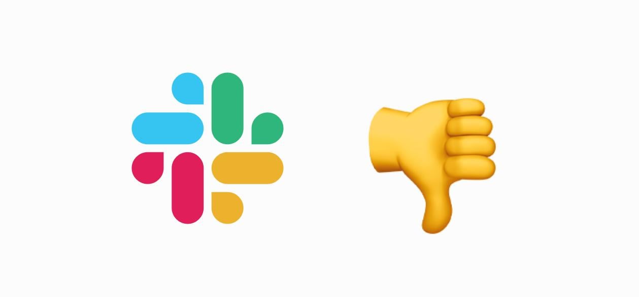
My colleagues and I couldn't escape the visual connection to common sexting emoji phrase Eggplant + Sweat Drops (we'll let you confirm what that means here):

Yep, we can see it:
And, well, yeah:
At least we have the octothorpe.
